Background Editor
Audience
Audience: Administrators & Read/Write Users
Overview
Backgrounds contain elements, such as company logos, legends and page numbers, and can be applied to Master Charts or Chart Documents. Users can create, modify, and manage their backgrounds in the Background Editor.
The following article provides information regarding the Background Editor user interface and functionality.
For step-by-step instructions for creating a new Background and applying it to a chart, reference the Creating Backgrounds article.
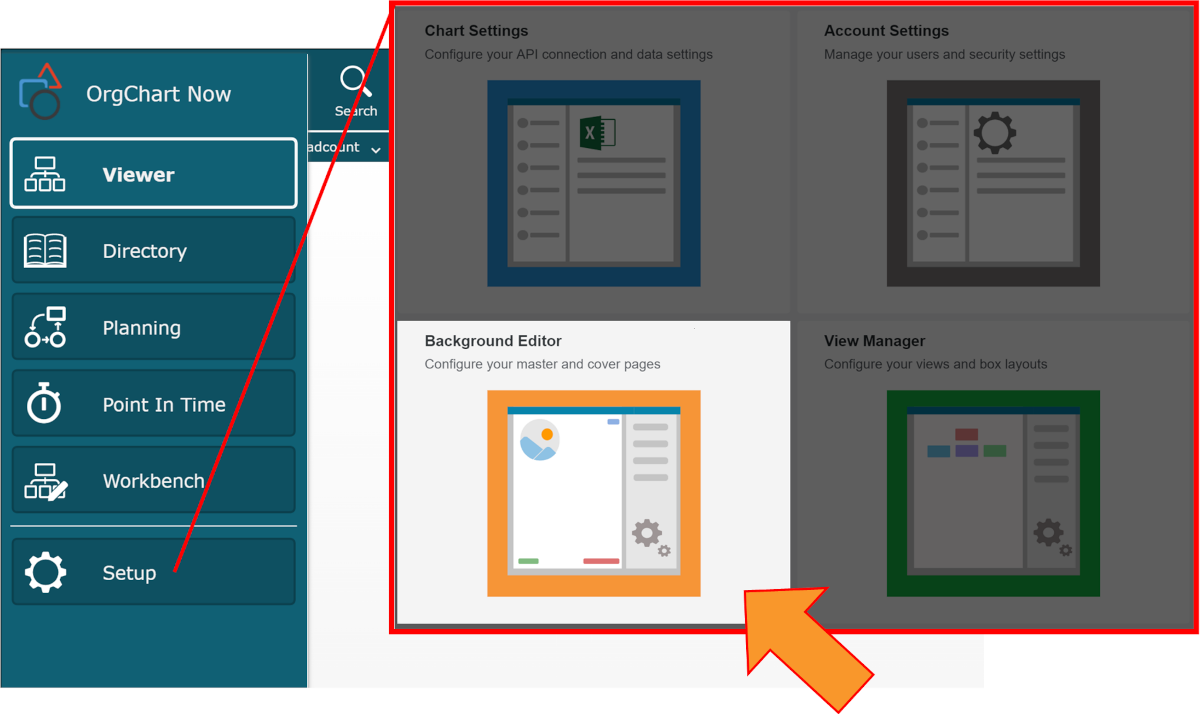
Accessing the Background Editor
Click on the Mode Switcher button, and then select the Setup option from the dropdown menu. The configuration tiles are displayed.
Click on the Background Editor option. Select one of the options in the Background Editor popup.
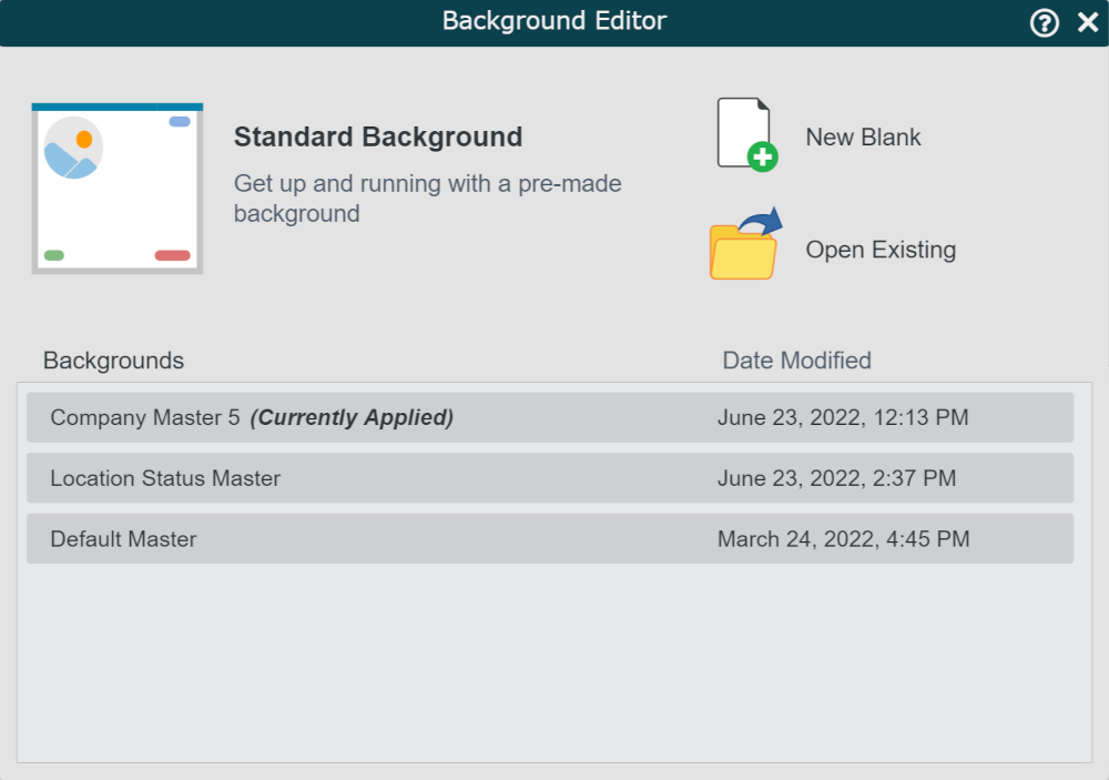

Click to create a new background using a pre-made template.

Click to create a new background from scratch.

Click to launch the File Manager, where you can select a background that has not been saved in the Background folder in the File Manager.
Backgrounds
A list of all backgrounds saved to the Backgrounds folder in the File Manager.
Click on a background in the list to edit it in the Background Editor.
The Background Editor user interface is displayed.
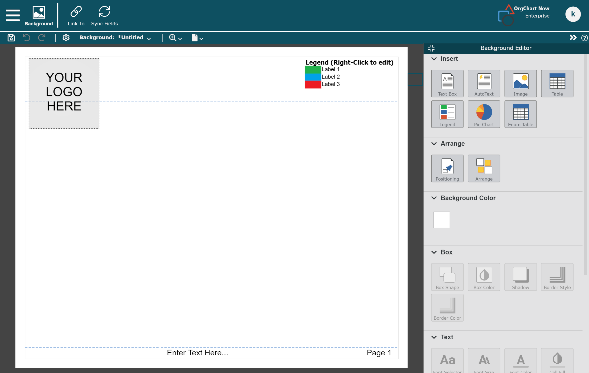
Navigating the Background Editor
The following options are available in the Top Toolbar of the Background Editor:
 | Click to preserve changes to the currently open background. |
 | Undo the last action. |
 | Re-do the last action that was undone. |
 | Click to launch Background Settings where you can modify page properties like header and footer size. |
Background | Displays the name of the open background. Click on the name of the background to open a menu with the following options:
|
 | Click to adjust the zoom settings on the background. The following Zoom percentages are available:
|
 | Click to define the page size of the background. |
Tools | Launch the Editor Tools panel. |
 | Link the current background to a Master Chart. |
 | Sync fields from a Mater Chart, in order to use those fields & formulas on the Background. |
 | Click to access the Background Editor tools. NoteBy default, the Background Editor tools will be shown. If you don't see them, click on this icon, which is located in the right corner of the Top Toolbar. |
 | Click to hide the Background Editor tools. |
Background Editor Tools
The Background Editor panel is displayed on the right-hand side of the screen, and is divided into 6 sections, each offering different editing options.
Click on the  to the left of a section heading to expand it, or click on the
  button to hide the section's contents.
Note
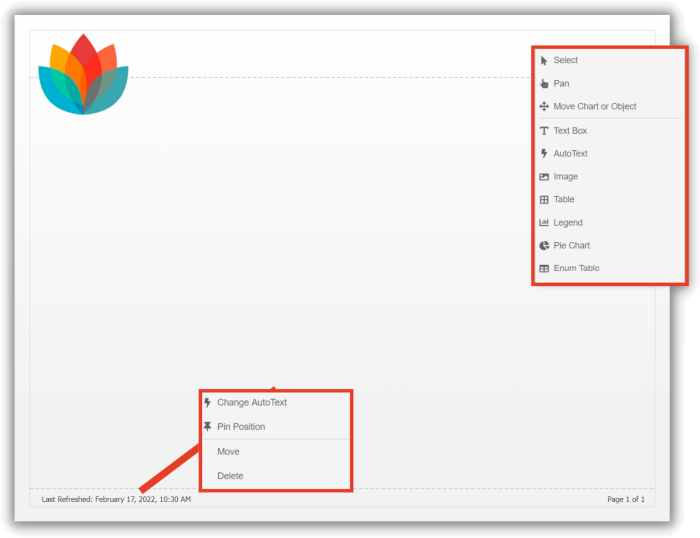
The options available in the Background Editor panel are also available when right-clicking on the background canvas, or by right-clicking on a background element.
Insert
The following elements can be inserted on a background. Click on one of the options, and then click on the canvas to add it to the background.
 | Insert a text box. |
 | Insert an AutoText element, such as page numbers or Subchart name. |
 | Insert an image. |
 | Insert a table. Right-click on the table to edit its properties in the Box Layout Editor. |
 | Insert a legend. Right-click on the table to edit its properties in the Box Layout Editor. |
 | Insert a Pie Chart. |
 | Insert an Enumerated Table. |
Arrange
The following options are available when a background element has been selected:
 | Pin object on the page. Pinned objects are automatically repositioned when the page is resized. |
 | Set order that objects (like text boxes and images) appear on the Master Page. |
Background Color
 | Set the background color. TipWhen selecting a background color, you can add a custom color or select the type of color fill (solid, gradient, or none). 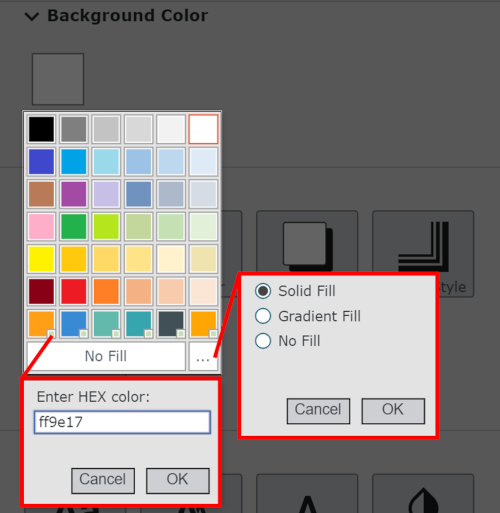 |
Box
The following options are available when a background element has been selected:
 | Change shape of box. |
 | Change the fill color. |
 | Turn box shadow effect on/off. |
 | Change the border thickness and style. |
 | Change the border color. |
Text
The following options are available when a background element containing text has been selected:
 | Chant the font style. |
 | Change the font size. |
 | Change the text color. |
 | Change the cell color. |
 | Bold text. |
 | Italicize text. |
 | Underline text. |
 | Configure the field label display settings.
|
Alignment
The following options are available when a background element containing text has been selected:
 | Align text to the top. |
 | Align text to the middle. |
 | Align text to the bottom. |
 | Make all cell content visible by displaying it on multiple lines. |
 | Align text to the left. |
 | Align text to the center. |
 | Align text to the right. |
 | Align text to both the right and left margins. Use this option when displaying a field label and a field value within the same cell. |